
AutoPlay Analytics is the reporting platform for dealers on the AutoPlay Sales Pipeline. It gives you a flexible set of dashboards for tracking lead management performance, with no need to build a report from scratch.
AutoPlay Analytics includes:
- A default set of report dashboards built for OEMs, dealer groups and dealerships, covering lead management performance
- Widget filtering, so you can slice data and present it the way you want
- Personalised dashboards at user, dealer or group level
- Dashboards laid out by dealer or by report, depending on how you want to view your data
- Click-through from a report straight to the Lead record in AutoPlayAuto.com
- Comparisons to previous periods and at-a-glance widgets
Where to find AutoPlay Analytics
Open AutoPlay Analytics from Sales Pipeline > Analytics Reporting in AutoPlayAuto.com, or go directly to reporting.autoplayauto.com and log in with your usual AutoPlay details.
When you log in, you land on the default set of reports configured for your account. For more on customising and managing your dashboards, see AutoPlay Analytics: how to personalise and manage AutoPlay Analytics reporting.
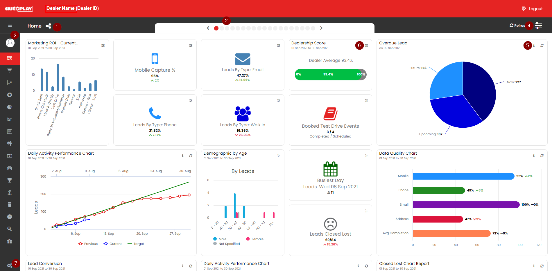
1. Home
Every account is made up of report dashboards, and each dashboard can hold any number of widgets. There are three types of widget:
- KPI widgets: small individual KPIs for a high-level view at a glance
- Charts: pie, line, bar and other graphs for a fuller picture
- Tables: data tables for granular detail behind the KPI widgets and charts, either as a summary or as individual records
A report dashboard is a collection of widgets you choose. AutoPlay provides one default Home dashboard covering a mix of related and unrelated widgets, plus dedicated dashboards for specific data types such as Overdue Leads, Closed Lost Leads and Data Quality. You can hide any of these default dashboards and build your own instead. See AutoPlay Analytics: how to personalise and manage AutoPlay Analytics reporting for the full walkthrough.
The dashboard name shows near the top of the screen (in the example above, this dashboard is labelled Home). The icon beside the name shows whether the dashboard is a shared report visible to multiple users.
2. Shortcut menu
Every dashboard you have set up shows as a red dot at the top of the Analytics screen. Cycle through your dashboards using the arrows on either side, or click a dot to jump straight to that dashboard.
3. Main navigation menu
The main navigation menu sits on the left and defaults to a collapsed state, showing only the icon for each dashboard. Click the menu icon to expand it and see the dashboard titles. Your profile photo (whatever you have uploaded to your user profile in AutoPlayAuto.com) shows above your name.
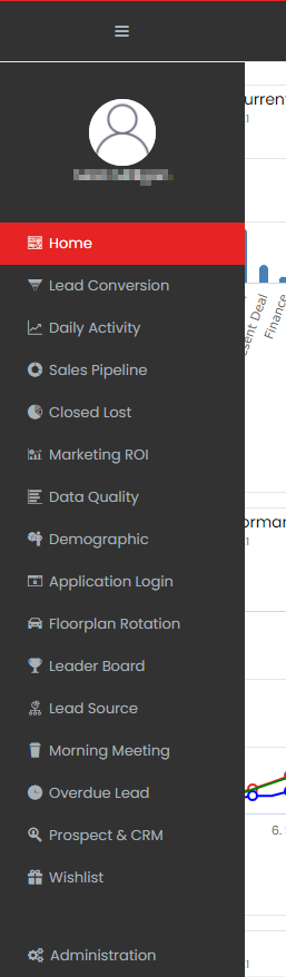
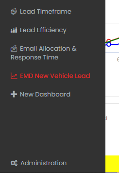
Shared base-set reports show in grey. Group, company and individual user reports show in red. At the bottom of the list is + New Dashboard, which lets you build a custom dashboard with whatever widgets and filters you choose. For more on dashboard visibility, see AutoPlay Analytics: how to personalise and manage AutoPlay Analytics reporting.
4. Master filter
There are two ways to filter data in Analytics.
- The Widget Filter applies to one widget only, stays applied after you log out, and is visible only on widgets you have rights to configure.
- The Master Filter, in the top right corner, applies to every widget on the dashboard you are currently viewing, for the duration of that view.
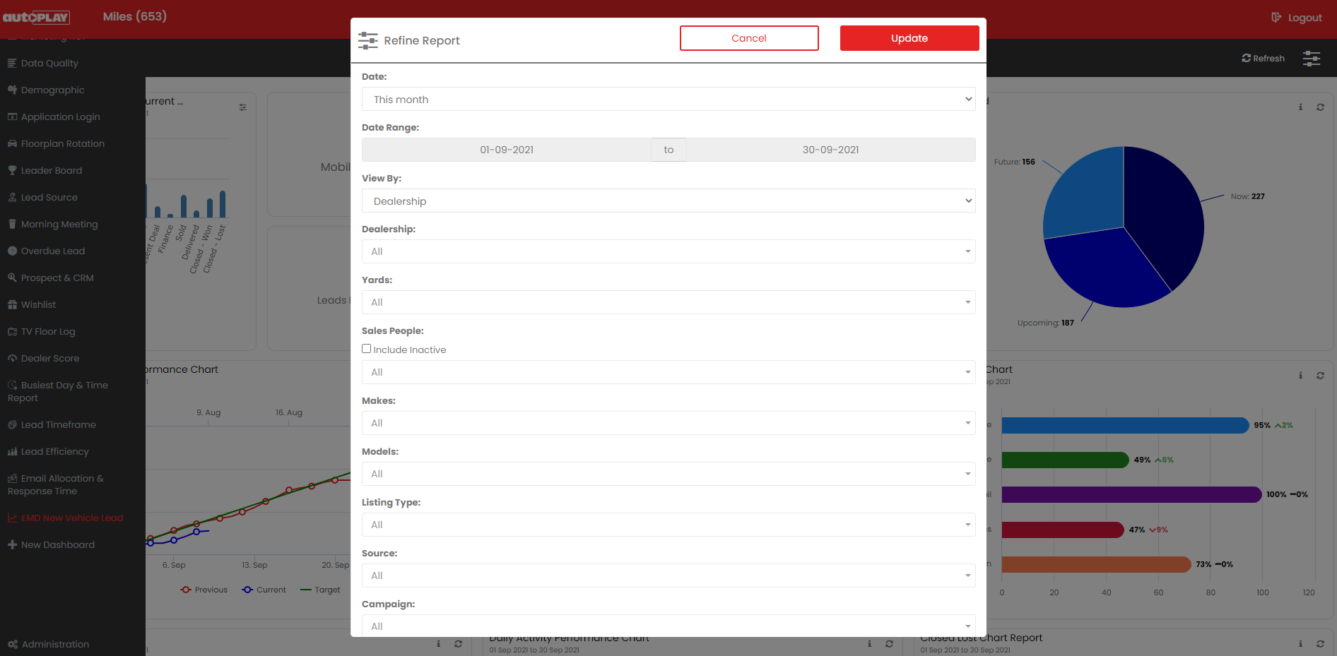
The exact filtering options depend on the widget, but the Master Filter typically offers:
- Date range: pre-set ranges or a custom range
- Previous period: a second comparison date range on selected reports
- Dealership: filter by dealer (group accounts)
- Yard: filter by yard
- Salespeople (including inactive): filter by user, active or inactive
- Makes: filter by make
- Models: filter by model
- Listing type: New, Demo, Used or No Listing
- Source: filter by lead source
- Campaign: filter by campaign
- Sub-campaigns: filter by sub-campaign
Search any filter list by keyword to narrow it down. Click an option to select it, and select as many as you need. Use Select All to select everything, then untick individual options, or use Deselect All to clear the filter and return to unfiltered data. Once you have set your filters, click off the filter panel and click the red Update button to apply them.
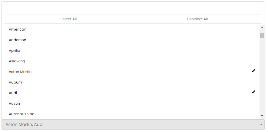
Some filters offer an inactive option, so you can filter by active records (for example, salespeople currently at the dealership) or inactive records (salespeople with historic leads who no longer use the AutoPlay account).

The date range filter has pre-set ranges (This Month, Last Month and so on), plus a Date Range option that opens date pickers for a custom range. You can set any range you like, though we recommend keeping it to 12 months or less, as longer ranges take more time to generate. A Previous Date Range picker also appears. This is only relevant to certain line chart widgets, such as Daily Activity Performance, and lets you compare against a like period in the past, the equivalent period immediately before your current range, or an unrelated range of your choosing.
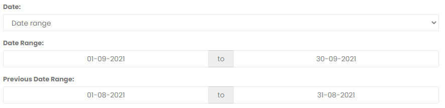
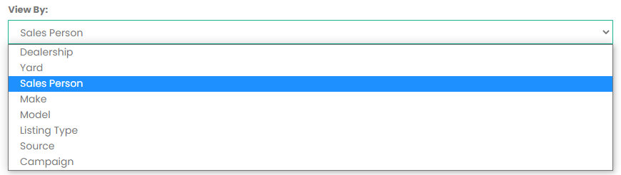
The Master Filter also includes a View By option. This applies only to data table widgets, and lets you present the table by Dealer, Yard, Salesperson, Make, Model, Listing Type, Source, Campaign or Retail/Non-Retail. This lets you filter by one dimension (for example, a specific source and make) while viewing the results by another (for example, salesperson).
5. Help
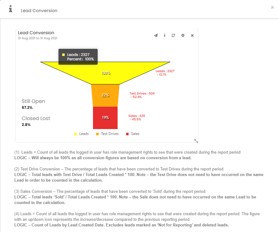
Click the i icon to open an info popup explaining what the report measures and how it is calculated. This can include text, images or video. Each widget has its own info content, which only AutoPlay staff with the correct permissions can update. See AutoPlay Analytics: how to personalise and manage AutoPlay Analytics reporting for more on how info content is maintained.
6. More menu
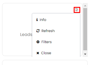
On smaller KPI widgets, the info icon is hidden to save space. Click the More icon to reveal it, along with Refresh, Filters (where applicable) and Close, which removes the widget from your dashboard if you have access to do so.
7. Administration
At the bottom of the menu, users with the correct permissions will see Administration, which controls the visibility of dashboards. See AutoPlay Analytics: how to personalise and manage AutoPlay Analytics reporting for how dashboard visibility works.
Customising report dashboards
Dashboards come in four levels:
- Base level
- Company/dealer level
- Group level
- User level
If you are viewing a base, company/dealer or group dashboard, you generally cannot change its layout or filters. The exception is managers with the Analytics Settings Admin role at dealer or company level. Read more about how dashboard management works in AutoPlay Analytics: how to personalise and manage AutoPlay Analytics reporting.
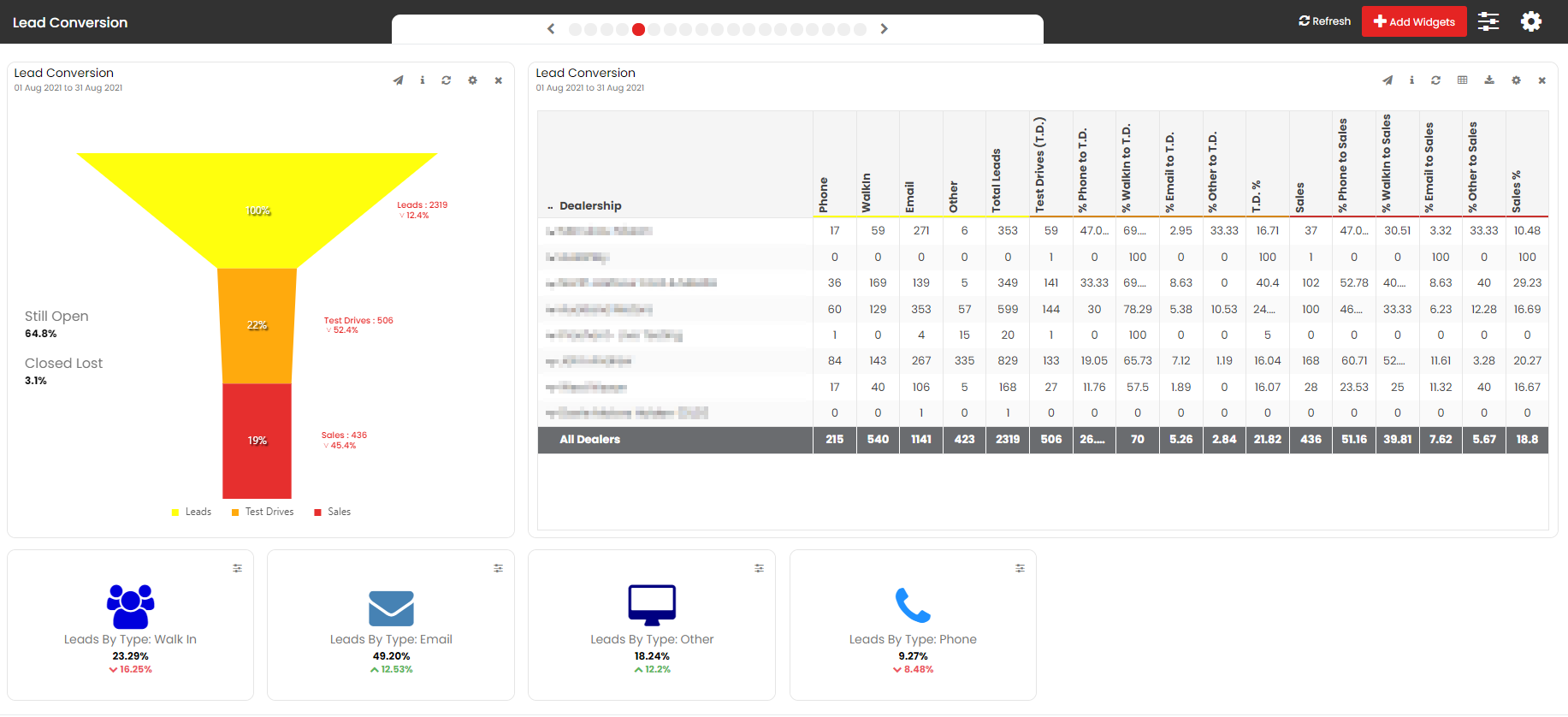
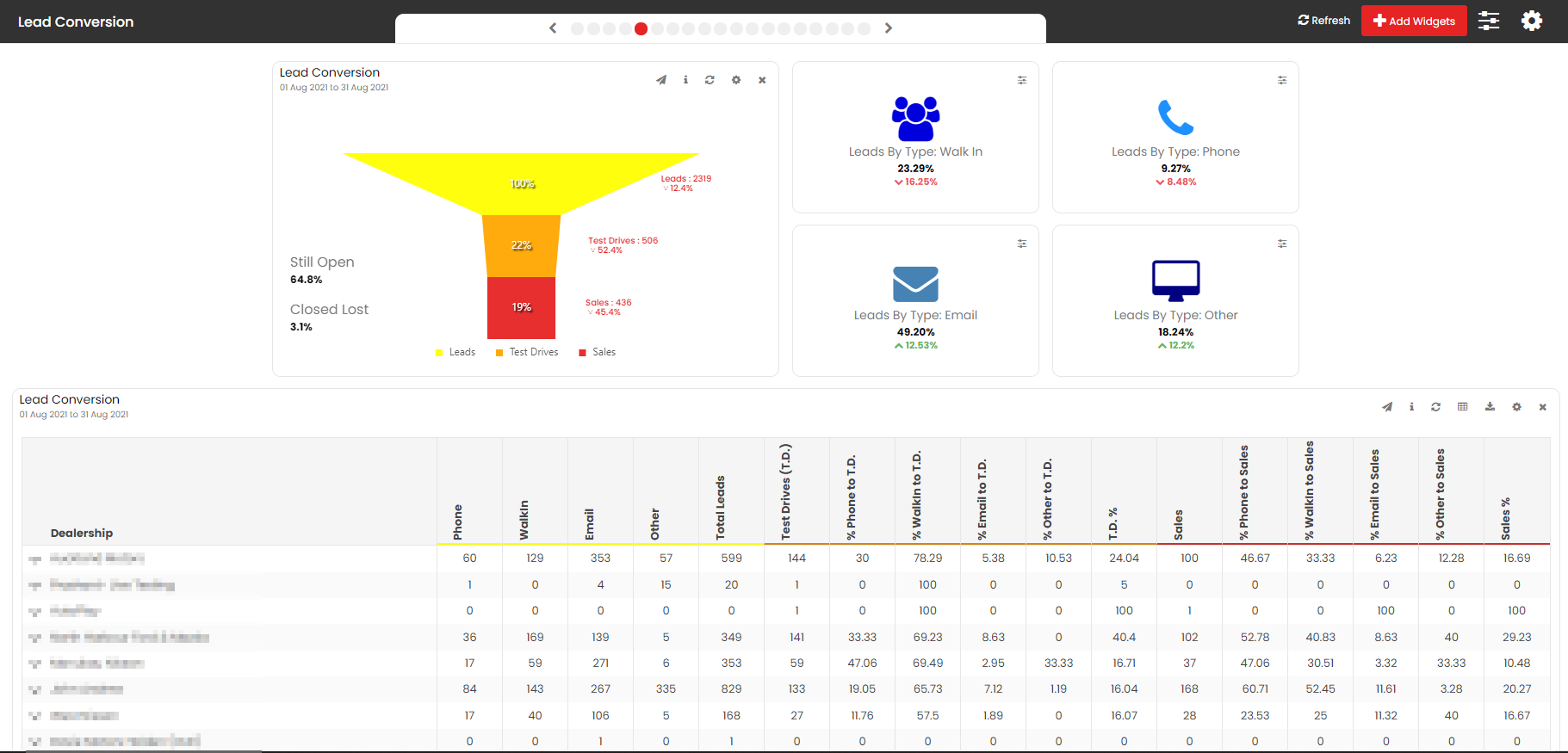
If you do have edit rights on a dashboard, hover over a widget to reveal a move icon, then drag and drop widgets to lay out the dashboard the way you want.
New widgets are added at a default size. KPI widgets stay locked to that size, but you can resize chart and table widgets to fit your layout. Hover over a corner of the widget until a resize icon appears, then drag to the size you want.
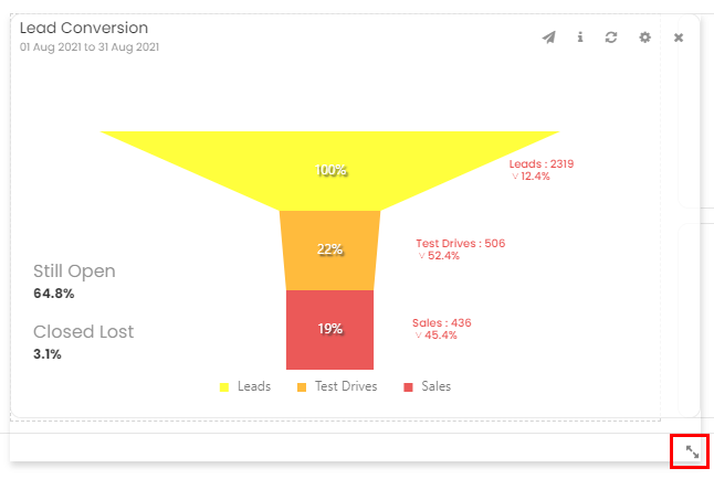
This gives you room to arrange your dashboard to suit how you work.
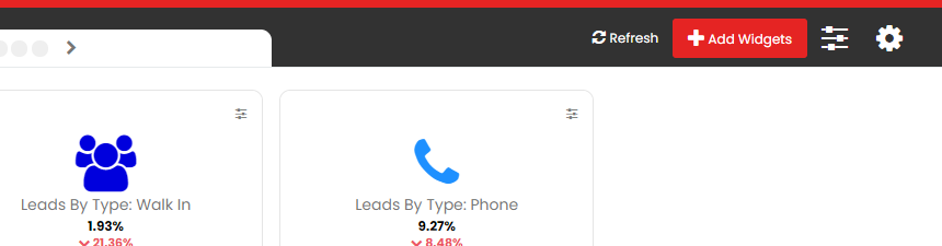
Unlike earlier AutoPlay reporting, Analytics does not restrict which widget types you can add to a dashboard. If you have edit rights, you will see the + Add Widgets button at the top right of the dashboard. If you do not have edit rights on a particular dashboard, this button will not show. Read more about adding widgets in AutoPlay Analytics: how to personalise and manage AutoPlay Analytics reporting.
If you can edit a dashboard, click the X on a widget to remove it. You can always add it back if you change your mind. On smaller KPI widgets, the Close button sits behind the More menu in the top right corner.
If you cannot resize, move or edit the filters on a dashboard, it means one of three things: you do not own the dashboard personally, you do not have the role permissions to edit company-level reports, or the dashboard is a shared group or base report.
In any of these cases, you can build your own version by clicking + New Dashboard in the left navigation menu. Read more in AutoPlay Analytics: how to personalise and manage AutoPlay Analytics reporting. Once you have created your own dashboard, you have full control to edit filters, move widgets and resize them.
Building your own version of a dashboard can leave you with duplicates of the same report: your personalised copy and the base, company or group version. See AutoPlay Analytics: how to personalise and manage AutoPlay Analytics reporting for how to hide the base, company or group version once you have your own.
Understanding KPI widgets, charts and data tables
A. Chart widgets
Analytics offers pie, donut, line and bar charts, plus specialised widgets such as conversion funnels and gauges. Each chart type is designed for its own purpose, but most share these elements:
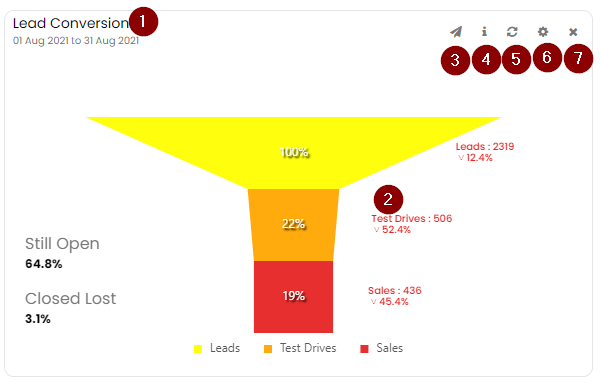
- Report title: every chart has a default title, which you can extend with your own text in the Widget Filter menu. The date range shows as a sub-title underneath, either as a range or a single day.
- Report content: most charts show an increase or decrease against the previous period, shown as an up or down percentage. For most reports, the previous period is the equivalent period immediately before the current one, though some let you choose a different comparison period.
- Canvas shortcut: where configured, a canvas icon links through to another dashboard, set in the Widget Filter menu under the Report Dashboard option.
- Info: explains what the chart measures and how it is calculated.
- Refresh: reports refresh automatically when you open or refine them. Use the refresh icon to force an update manually.
- Widget filters: filter the data for this widget only. Use the Master Filter to filter every widget on the dashboard at once.
- Close: remove the widget using the X icon.
B. KPI widgets
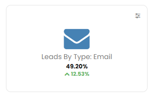
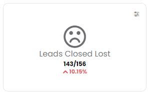
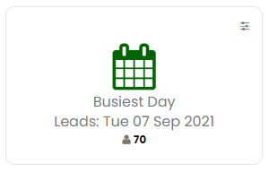
KPI widgets convey a single key metric at a glance. They are fixed in size and, to save space, do not display a title, date range or the usual icons. Access the widget filters, info and close options from the More icon in the top right corner. Some KPI widgets show a green percentage increase or a red percentage decrease, based on the reporting period against the previous period.
C. Data table widgets
Data tables give you more granular detail behind your KPI widgets and charts. Most are summary-level tables, though a few list individual records, such as leads, calendar events or test drives. Common elements include:
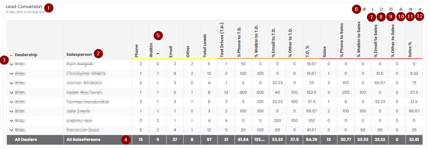
- Report title: as with chart widgets, you can extend the default title in the Widget Filter menu, with the date range shown as a sub-title.
- View By column: most tables let you change how the data is grouped, regardless of how it is filtered. Options include Dealer, Yard, Salesperson, Make, Model, Listing Type, Source, Campaign and Retail/Non-Retail, plus custom options on some reports. Change this from the widget filter.
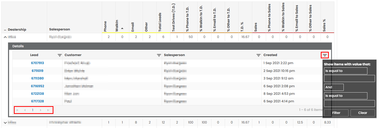
- Detail view sub-table: click the down arrow on the left of a row to drill into the individual lead records behind it. If the Lead ID shows in blue, click it to open that lead in AutoPlayAuto.com, useful for tidying up a lead without hunting it down separately. This click-through only works for leads created in your own AutoPlay account. Group dealers cannot click through to leads they do not have rights to. The detail view has its own filter for long lists, and pages through results using the page numbers in the bottom left corner. Click the up arrow to collapse the sub-table again.
- Total count: some tables include a sum of all the values shown.
- Sort by: click a column heading to sort by that column, alphabetically, numerically or chronologically depending on the data.
- Canvas shortcut: where configured, links through to another dashboard, set in the widget filter under the Report Dashboard option.
- Info: explains what the table measures and how it is calculated.
- Refresh: tables refresh automatically on open or when refined. Use the refresh icon to force an update.
- View Raw Data: opens the full data set behind the table, with on-screen filtering and sorting by column.
Note: View Raw Data can take time to render, and is disabled automatically if the data set is too large for your browser to handle. For small to mid-sized dealers this is usually several years of data. For high-volume dealers or groups it can be as little as six months. If the button is greyed out, try a shorter date range, or use Download Data instead.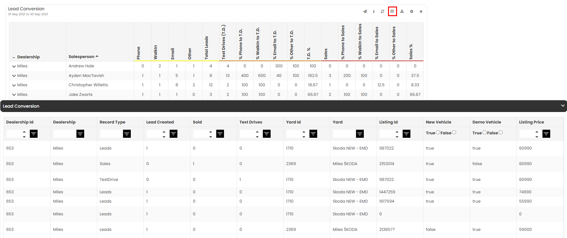
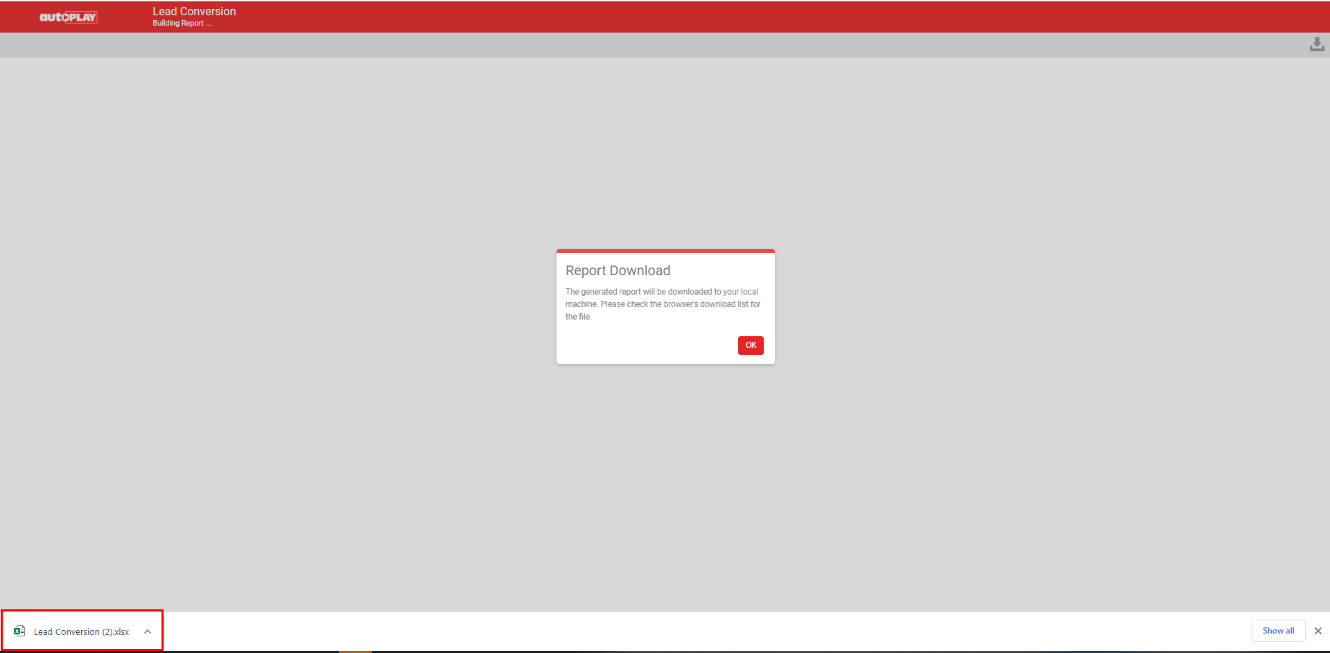
- Download Data: downloads the raw data as a file you can open in Excel, useful for larger data sets. This opens a new tab, so you can keep using Analytics while the download runs. A dialog confirms when the download is complete. Click OK to close it and return to Analytics.
- Widget filters: filter the data for this widget only. Use the Master Filter to filter every widget on the dashboard at once.
- Close: remove the widget using the X icon.